
Led UX for a multi-stakeholder analytics tool used by public sector agencies to monitor national health data

1. UX Team Lead embedded in a cross-functional federal team
2. Conducted discovery research, created user archetypes, and restructured Confluence documentation
3. Designed branded templates, onboarding materials, and stakeholder visuals
4. Liaison between technical SMEs and non technical users
1.5 years

1. Low engagement with documentation despite positive feedback
2. Fragmented onboarding experience for new users
3. Lack of visual consistency across internal tools
4. Difficulty communicating data governance concepts across teams
2. Fragmented onboarding experience for new users
3. Lack of visual consistency across internal tools
4. Difficulty communicating data governance concepts across teams
Logo:
1. Created a new logo for the team and chose brand colors
1. Created a new logo for the team and chose brand colors
The original Logo that was reworked to reflect some significant business changes

The thinking behind the logo redo along in collaboration with the POs and clients
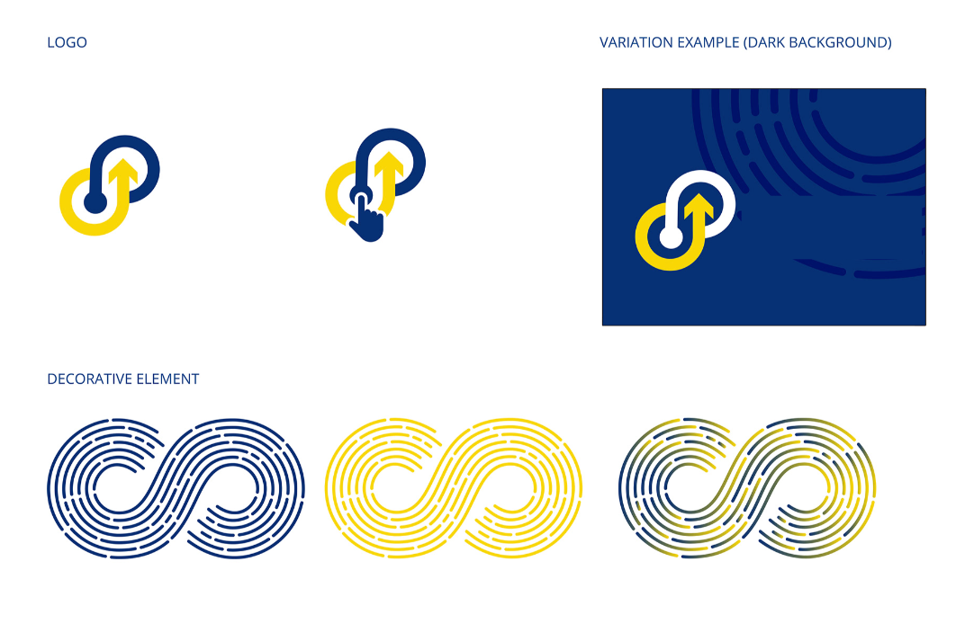
Finalized updated logo:

Iconography:
1. created branded Iconography to increase brand awareness
1. created branded Iconography to increase brand awareness
These icons were created to establish some consistency around how users navigate the document hub. One of the hallmarks of iconography is allowing users to feel comfortable navigating a space and understand what the space provides.
These icons allow users to identify what type of work they are wanting to do.
These icons allow users to identify what type of work they are wanting to do.

User Archetypes
1. Created 8 archetypes to tailor content and onboarding
1. Created 8 archetypes to tailor content and onboarding
UX Goal: Streamline onboarding and provide contextual wayfinding
Tactic: Created just-in-time tooltips and visual walkthroughs for entry points

Journey Maps
1. Used Figma and Mural/ Miro to visualize user journeys
1. Used Figma and Mural/ Miro to visualize user journeys
UX Goals for This Journey Mapping
Identify onboarding bottlenecks and clarify role-based actions
Improve system transparency through better copy and in-product messaging
Reduce first-contribution anxiety through just-in-time help
Support re-engagement with passive users by building a feedback loop
Visual Documentation Hub
1. Redesigned Confluence to be role-specific and visual first
2. Embedded Figma cards for navigation
3. Added FAQ's, flow diagrams and self -service entry points
1. Redesigned Confluence to be role-specific and visual first
2. Embedded Figma cards for navigation
3. Added FAQ's, flow diagrams and self -service entry points
Templates and Brand System
1. Developed templates (emails, memos, slide deck, user research) to standardize external and internal communications
2. Updated brand book (last update 2020) to reflect new self service positioning
1. Developed templates (emails, memos, slide deck, user research) to standardize external and internal communications
2. Updated brand book (last update 2020) to reflect new self service positioning


Improved documentation access/ engagement by 3x in 6months
Streamlined onboarding for 100+ new users across multiple federal teams
Reduced help desk inquires related to self-service by 25%
Used by leadership as a model for other internal platforms
Streamlined onboarding for 100+ new users across multiple federal teams
Reduced help desk inquires related to self-service by 25%
Used by leadership as a model for other internal platforms

Governance & Platform Roadmap Alignment
1. Mapped UX strategy to roadmap and governance models
2. Created a visual stakeholder map to clarify influence and interest
1. Mapped UX strategy to roadmap and governance models
2. Created a visual stakeholder map to clarify influence and interest
This project taught me the power of visual thinking and how I was able to leverage this to assist users with understanding how they might navigate technically dense and difficult documentation in a political environment.
Building archetypes and aligning with governance helped me influence product strategy, the importance of understanding who our users are and the focus of switching from concierge to self help service.
Building archetypes and aligning with governance helped me influence product strategy, the importance of understanding who our users are and the focus of switching from concierge to self help service.